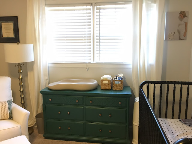
Like most girls who long for the day to become a mother, visions of what my baby's nursery would look like filled my head (and Pinterest boards). I always knew I didn't want it to look too "baby," if that makes any sense. Black and white always stuck out to me, too. Apparently, babies can only see in black and white during their first few weeks of life, mostly due to the high contrast of the colors. After deciding on the black and white, I knew I needed a pop of some color and I always came back to the picture of the dresser in this nursery.
Trying to find the perfect accent rug was quite the task, and it still isn't perfect, but this one is soft and I'm learning to deal with it. :)
We rearranged the nursery quite a few times, even after they were born, and think we finally found the perfect layout!
The framed photo to the left of the window is a poem that Cameron's father wrote when the original Travis Baker was born. Cameron's mom typed it and had it framed. How special!
The canvas to the right of the window was the photo that I took for my 24 week bump pic. My aunt had it blown up for one of my showers.
The framed hand calligraphied names are actually cards that my best friend, Emily, had done for me by one of her student's moms! I love them so much, I probably won't ever use the other cards! Haha
Cribs - Jenny Lind DaVinci
Crib sheets - Modern Burlap
Crib skirt - Land of Nod
Abstract art work - Target
Cutains - Ikea
Glider - Little Castle via Baby Bloomers
Rug - Amazon
Lamp - Homegoods
Dresser - Repurposed
Dresser color - Valspar Capital Green
Dresser knobs - PullsDirect.com
Changing table - Keekaroo Peanut
Changing table baskets - Target
Bookshelves - Target
Toy bin - Homegoods
Driftwood Letters - Etsy
Driftwood Letters - Etsy


Looks great. You are so much more organized than I am. Not sure where it came from, but it definitely wasn't me or your dad.
ReplyDeleteHaha, hi mom.
DeleteLooks phenomenal! I love the pops of color against the black and white!
ReplyDeleteThis looks so good - I love all of the details!!
ReplyDeleteI love the driftwood letters!
ReplyDeleteI love it - its the perfect little space and the drift wood letters are awesome.
ReplyDeleteI love it! What a perfect space for your boys.
ReplyDeleteSo cute and perfect!!
ReplyDeleteIts really cute! It definitely all came together well--love it :)
ReplyDeleteI absolutely love it! Looks like it could be in a magazine!
ReplyDeleteI love it.
ReplyDelete